Tech Tackles X Brand Identity + Website
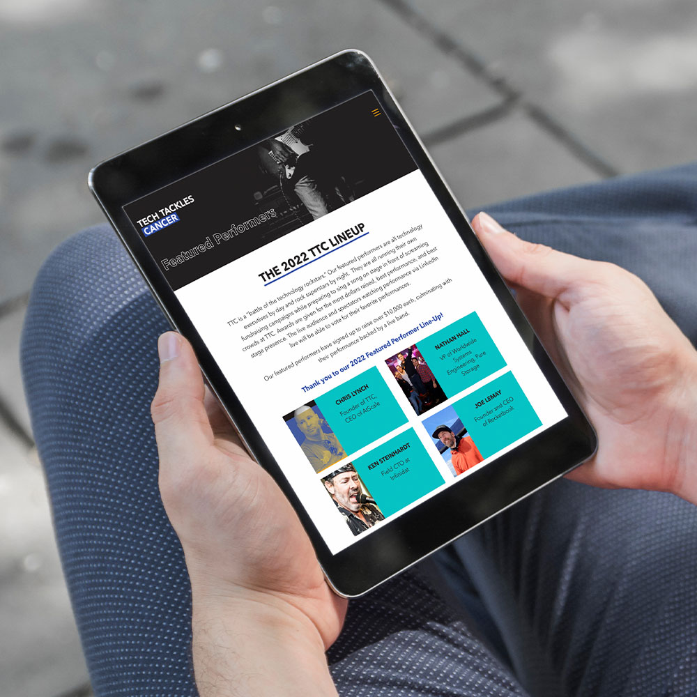
Tech Tackles Cancer is an annual concert dedicated to raising funds for pediatric cancer-related causes. The event brings together Boston’s tech community, with rock music performances by community members.
Chris Lynch, serial entrepreneur and founder of several major B2B tech companies, wanted to fulfill a broader vision of the event. He wanted to increase visibility for the event with fresh branding, promotional materials, concert posters, and t-shirts. Mr. Lynch’s long-term plan is to establish Tech Tackles X as a 501(c)(3) nonprofit organization which can serve as a fundraising vehicle not only for the cancer event, but also for other events and causes (e.g., Tech Tackles Hunger, Tech Tackles Poverty, etc.). As such, it was key to keep future extensibility in mind when developing the brand.
I was tasked with creating a flexible identity system that could be used across these different initiatives. Knowing the potential for the organization’s needs to evolve as it progresses, my solution was to create a modular logo, inspired by the cursor underscore in code editors. The underscore serves as a subtle nod to the organization’s roots in the tech sector, while also allowing it to be used as a container shape for the cause or event in question.
The primary color palette is bright and energetic, evocative of the concert and the enthusiasm shared by the volunteer-based marketing team. With a variety of colors, the palette offers the possibility to differentiate each fundraiser or cause with a different main color (blue for cancer, yellow for hunger, etc.). The typography is clean and approachable, and neutral enough that it can represent different causes without feeling out-of-place.
The image style is inspired by 1980s punk rock concert photos, with dark, even tones contrasted by bright pops of color. The poster series, made possible due to The Sinclair‘s walls of frames, is also punk rock-inspired, featuring characteristics of each performer with layers of texture and illustration in bold brand colors. The website and print collateral are meant to be eye-catching with strong contrast, grabbing a viewer’s attention like loud rock music.
This project challenged me to think systematically, planning for the present as well as potential variables in the future. It was deeply fulfilling to produce this brand then see it come to life at the venue. I could feel that I was making a difference, helping to raise funds and amplify the event’s public image in the name of a good cause.
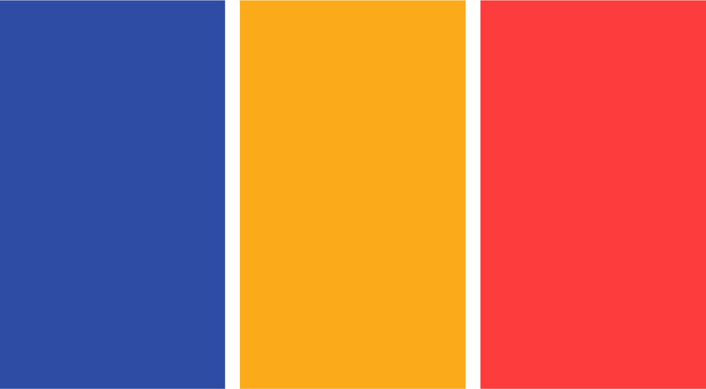

Primary Palette


Secondary Palette
Concert Poster Series


An excerpt of a series of 14 posters featuring the name of each performer at the event and his/her sponsor company
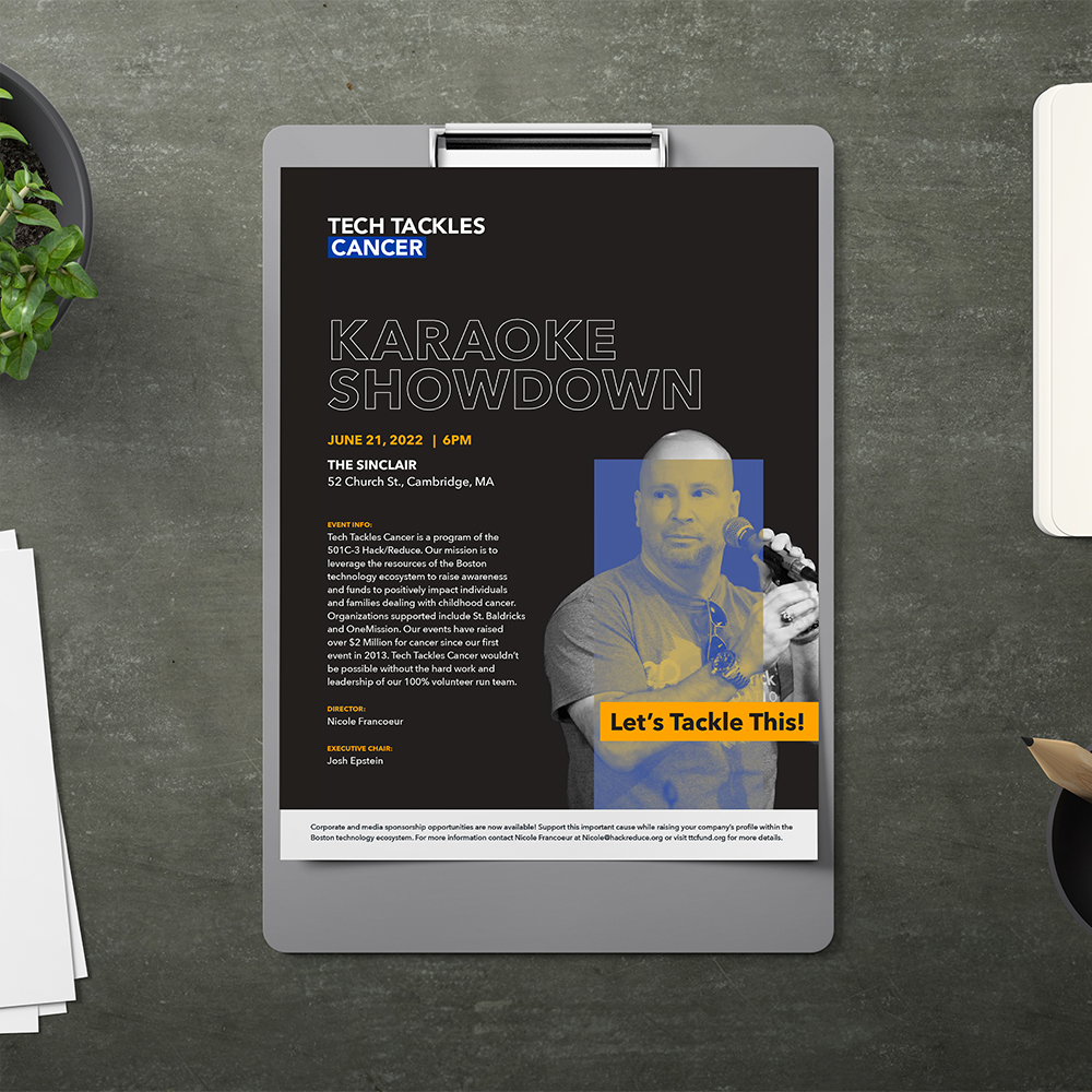

Promotional 8.5 x 11" flyer
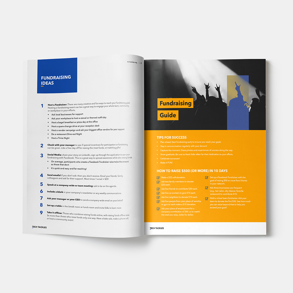

Sponsorship toolkit brochure